Design Retrofit
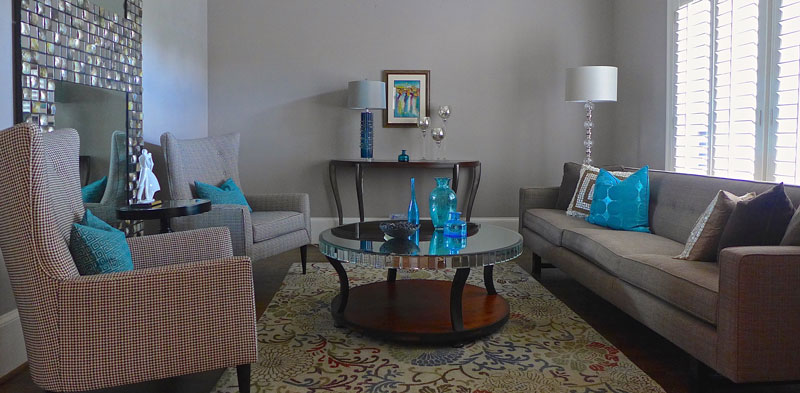
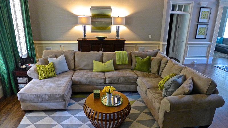
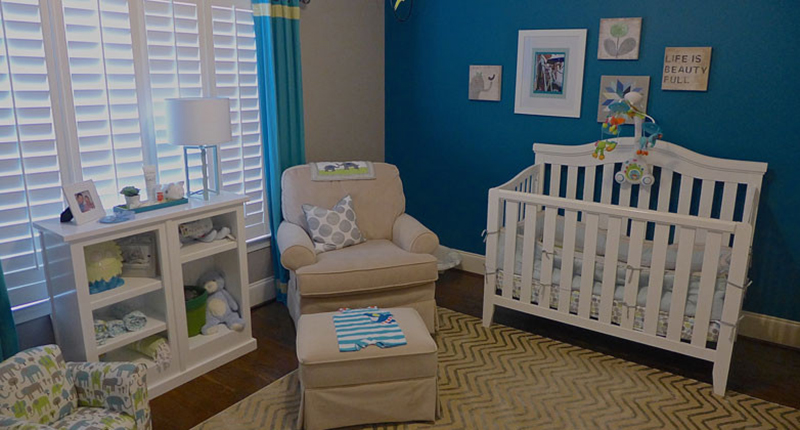
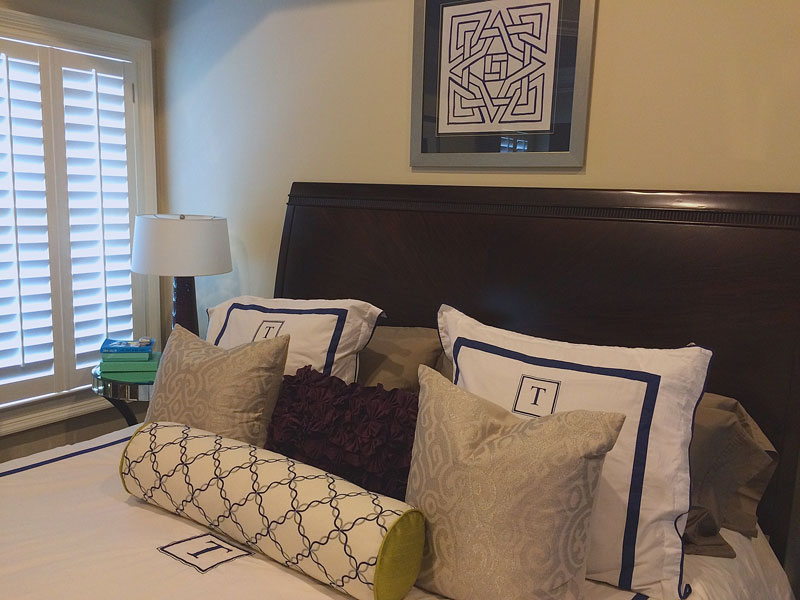
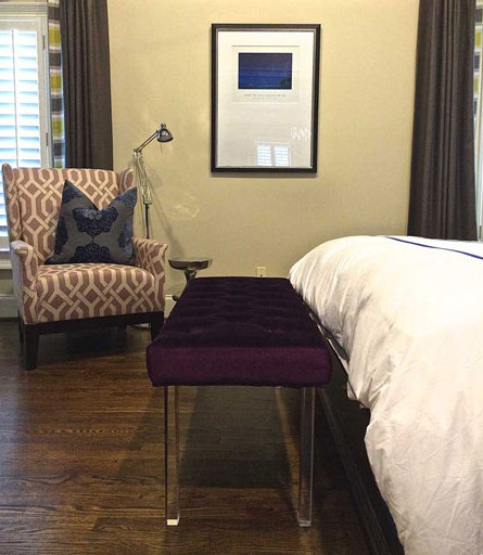
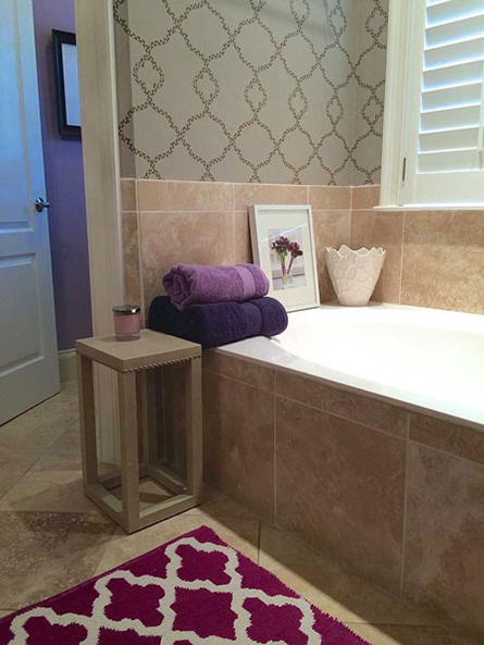
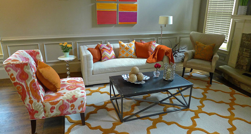
This young couple’s move to a home inside the perimeter involved designing several new rooms, using only a few furniture pieces from the former home. Rooms including the master, sitting and family rooms among others were designed with the home owners’ favorite colors and keeping an eye on modern family-friendly comfort (with just enough glam for good measure).
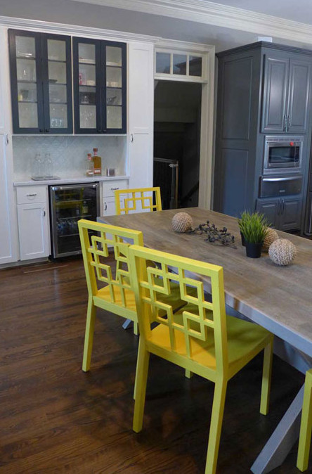
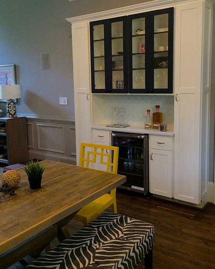
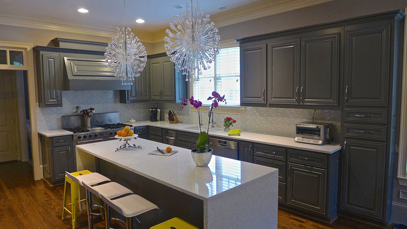
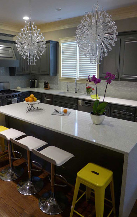
The largest improvement, however, came in the form of a kitchen and laundry redesign that created new ample storage and better flow to make the space a better fit for the new owners and their three children. Some cabinets were moved to different more usable spaces that the builder did not originally utilize. The too-wide island was cut back to create a better main walkway. The refrigerator was built in and surrounded by new cabinetry and a warming drawer was added. The microwave was moved from its spot by the exit to the fridge wall. A new bar was created complete with a second small fridge for drinks, where a desk previously sat. The desk and its cabinets were repurposed in the laundry room, thus keeping mail and home computer out of sight.
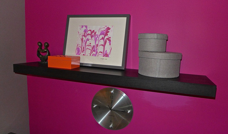
The expanded laundry space was also outfitted with additional cabinets for overflow of serving items and to accommodate extra laundry supplies for the big family. All kitchen and laundry cabinets were painted monochromatic grey tones. The new bar was painted ivory to complement the house’s trim work and has a white glass backsplash in a Moroccan design that coordinates with the new white and silver flecked quartz countertop and modern linear backsplash in the main area. The overall effect is slightly glamorous, exactly the look the homeowner wanted. She was so glad to see the “brown cabinets” and “brown granite” go. The kitchen color scheme is a perfect foil to the accents she loves: oranges, yellows and especially fuchsia that are found in and around the kitchen and laundry. (Please note photo of the Fuchsia color on clock wall that makes for a very fun laundry.)
Renovation and Construction – Bob Elsey
